Common Ground Foundation aims to spark dialogue that leads to mutual understanding amongst Hungarians, by recognizing and coming to terms with the traumatic events of the 20th century.
The one sided and controversial interpretations of the 20th century’s tragic events (including the treaty of Trianon, the Holocaust, the communist regime of the second half of the century, the 1956 revolution against this regime, and finally its 1989 overthrow) have long made constructive dialogue next to impossible. This is closely related to the state of division Hungary is in, both culturally and politically. Discussing and understanding the traumas of history is the first step leading towards a common future built on mutual trust.
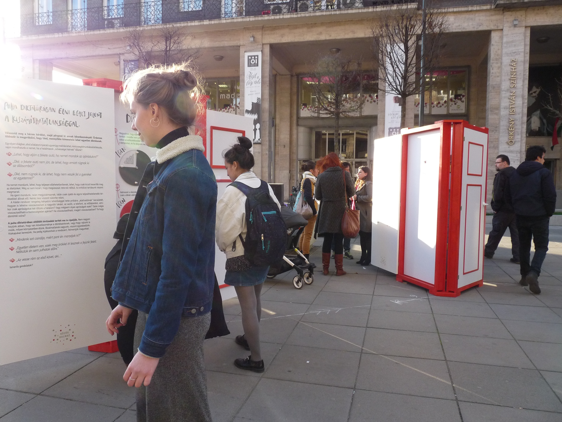
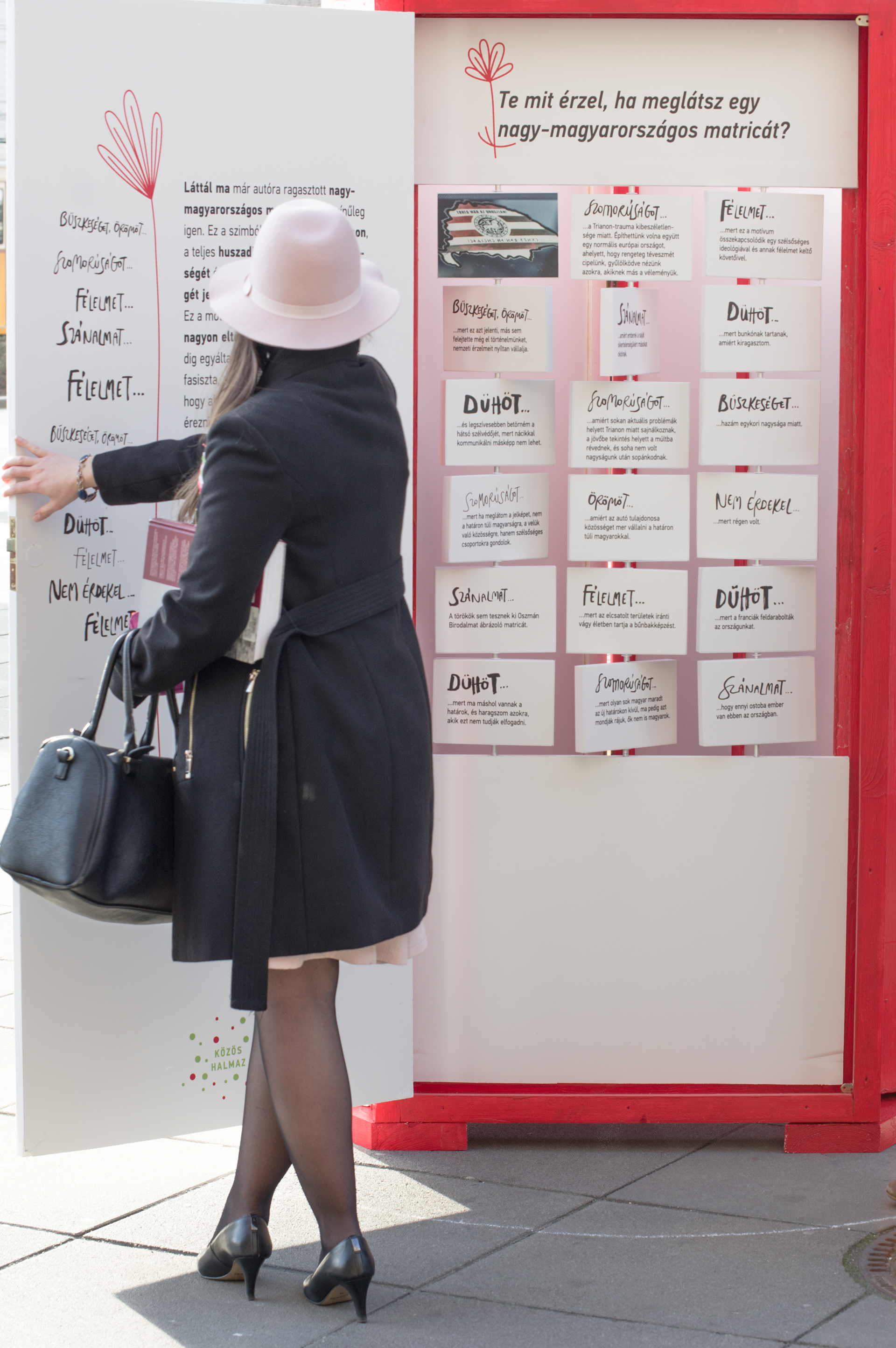
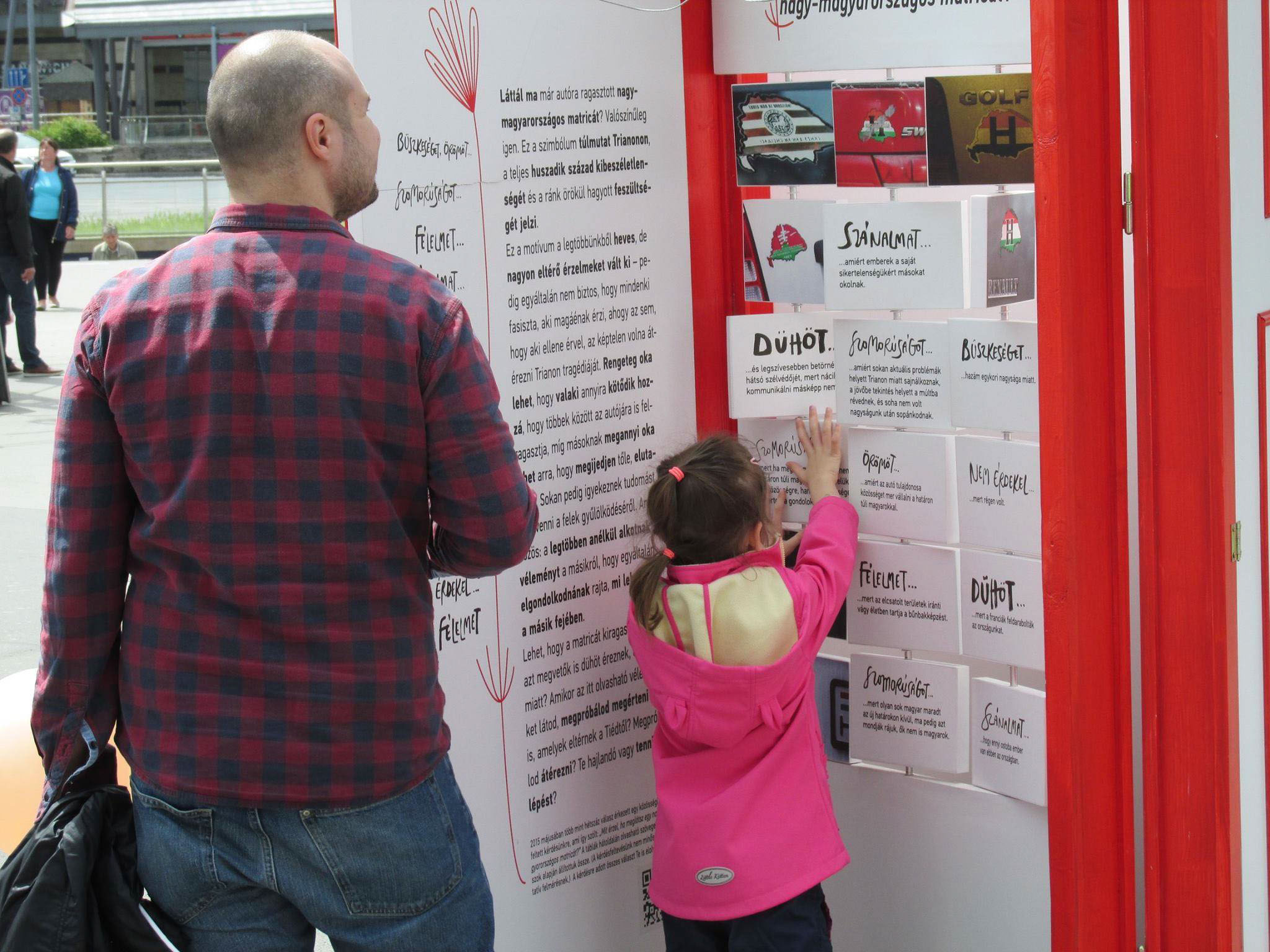
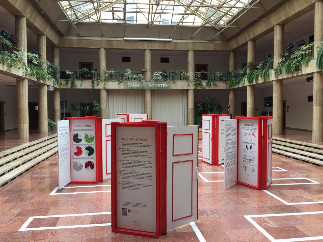
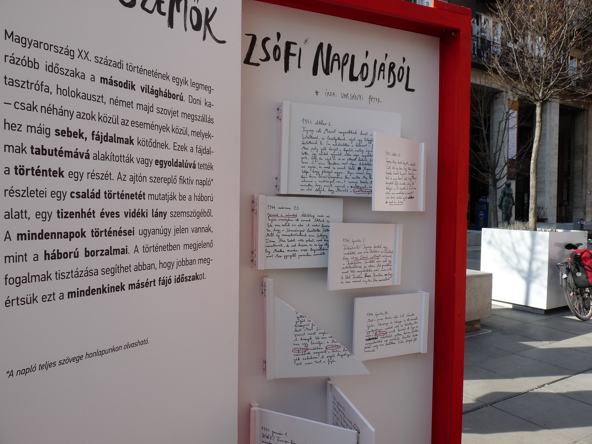
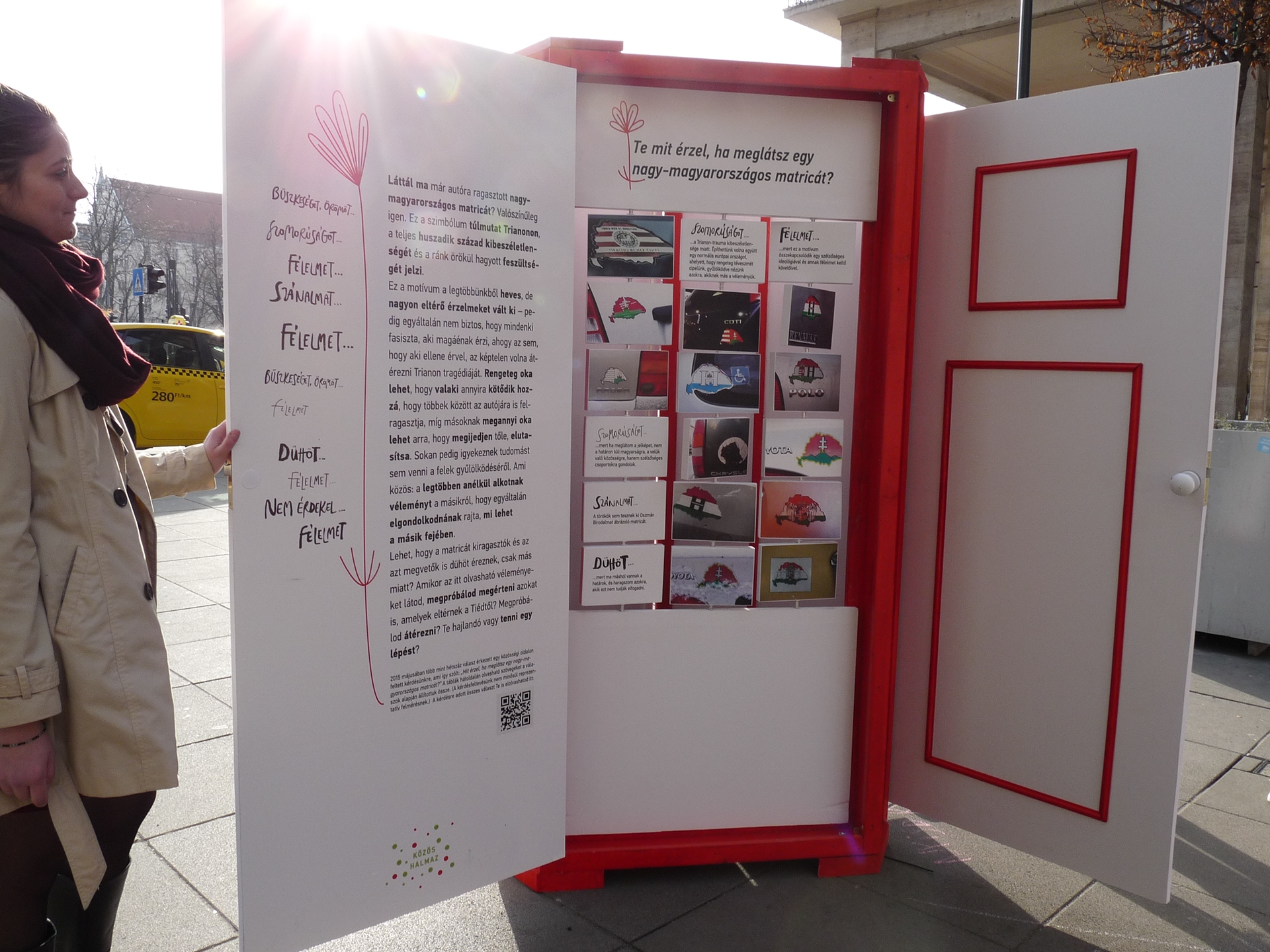
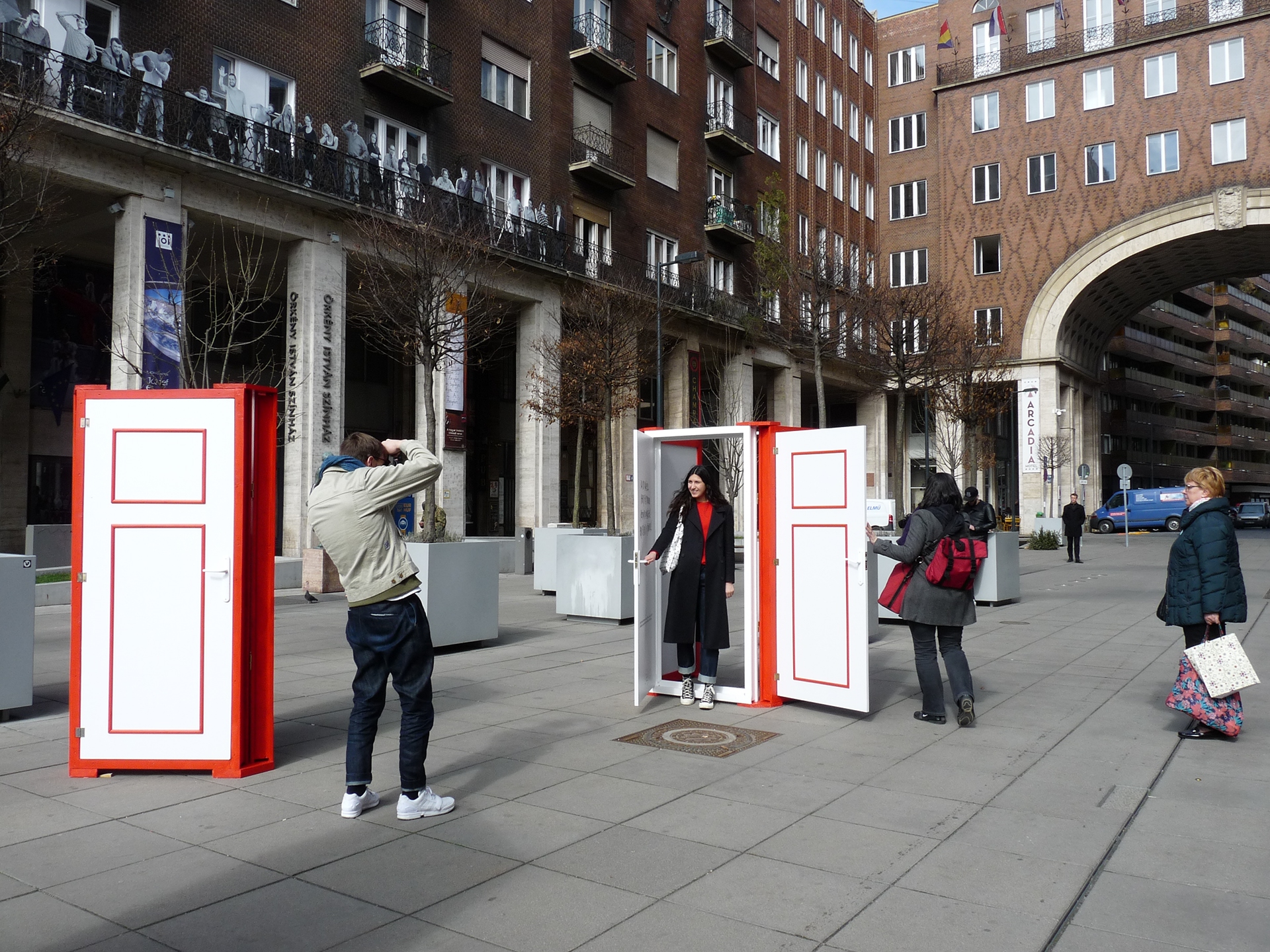
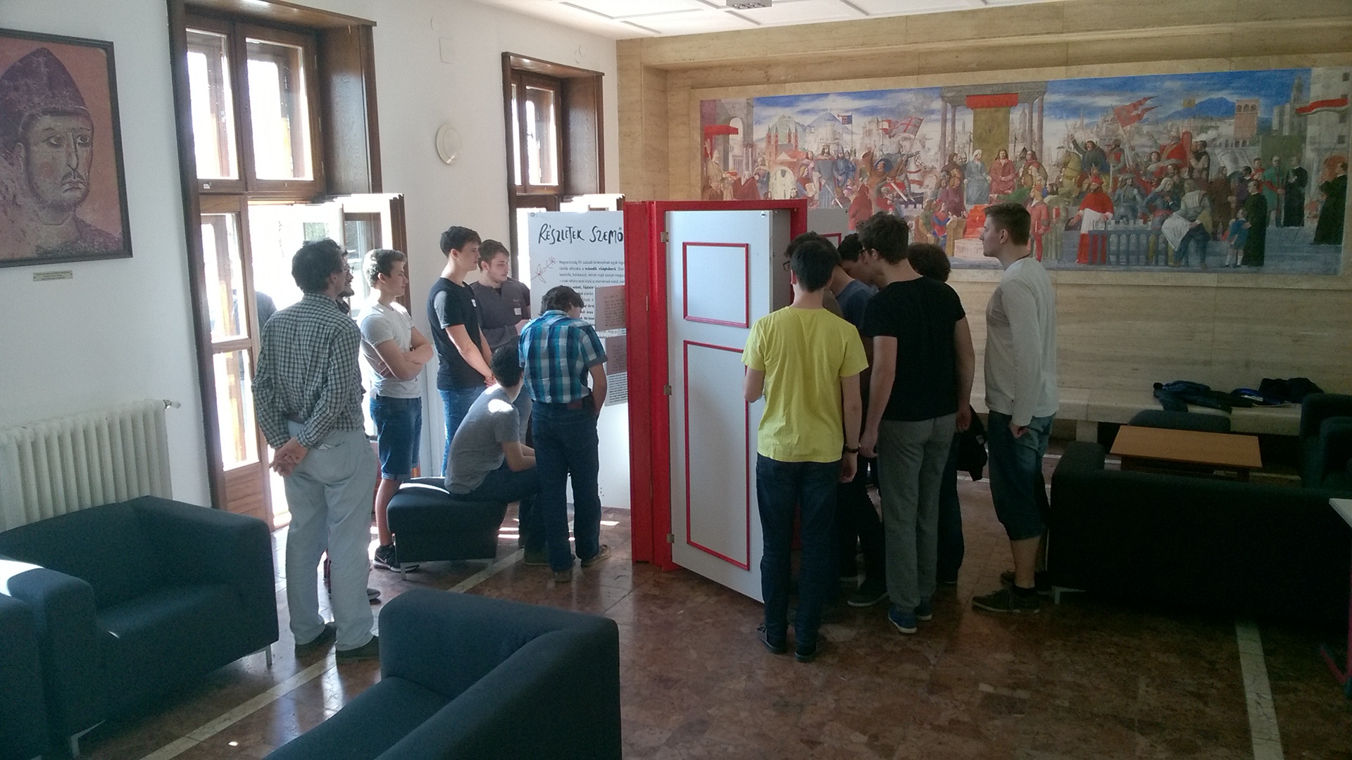
We present the traumas of the century on diverse and colorful doors, ready to be opened or closed. We need to open up to the past, so that we can close it, and turn to the future. The interactive objects encourage visitors and students to understand and empathize with others’ interpretations of the same events.
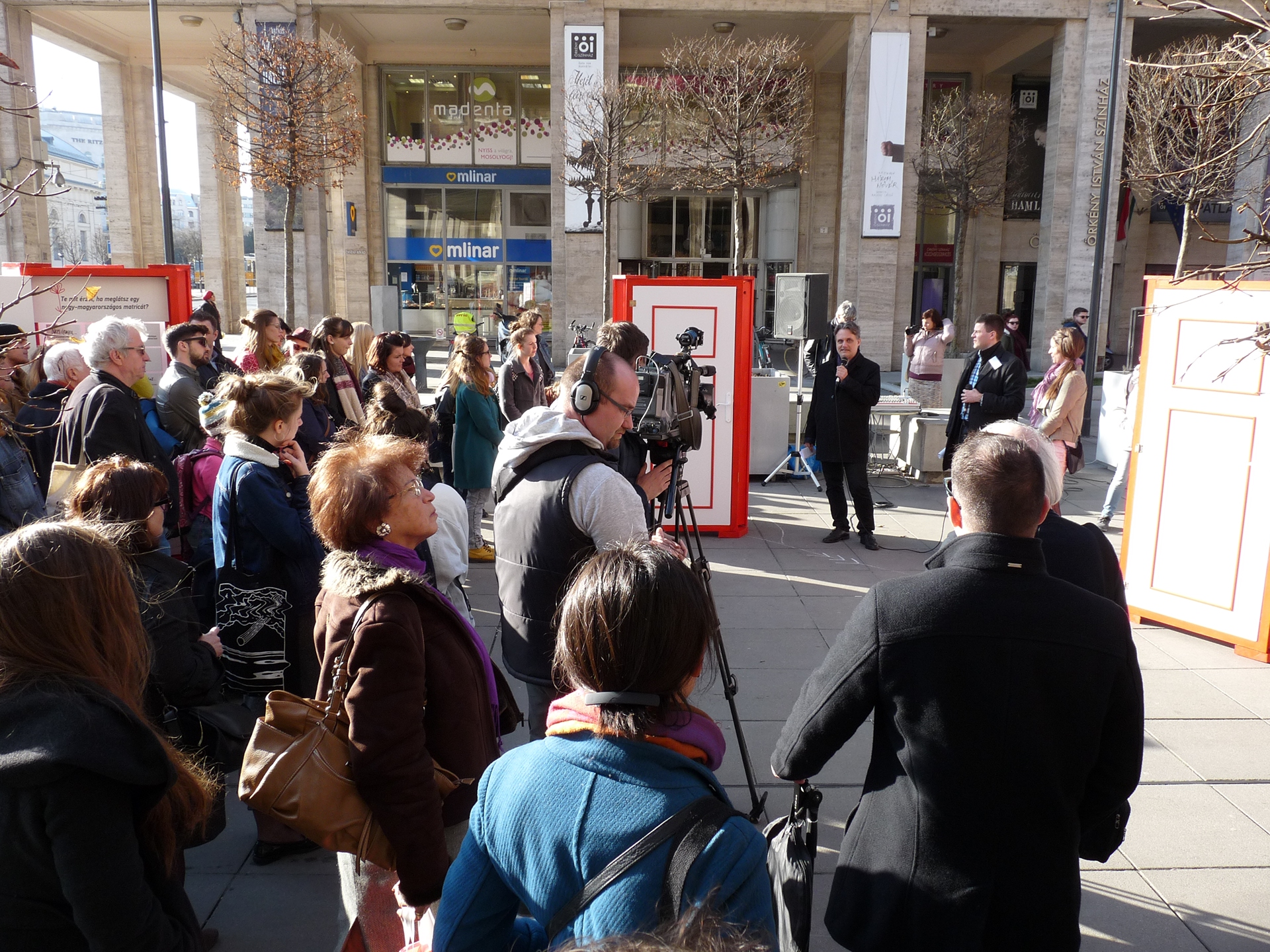
The exhibition of Common Ground was launched in March, 2017 in Budapest’s central Madách Square. Since then, the doors have shown up at various other locations across the country, including public squares, university lobbies, events and festivals.
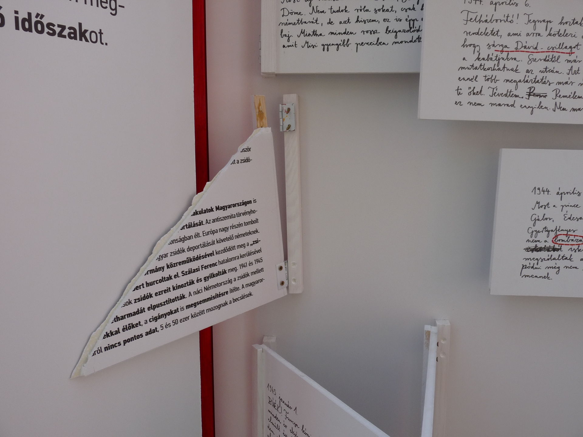
We already got validation in the first 24 hours. Some topics still run deep.
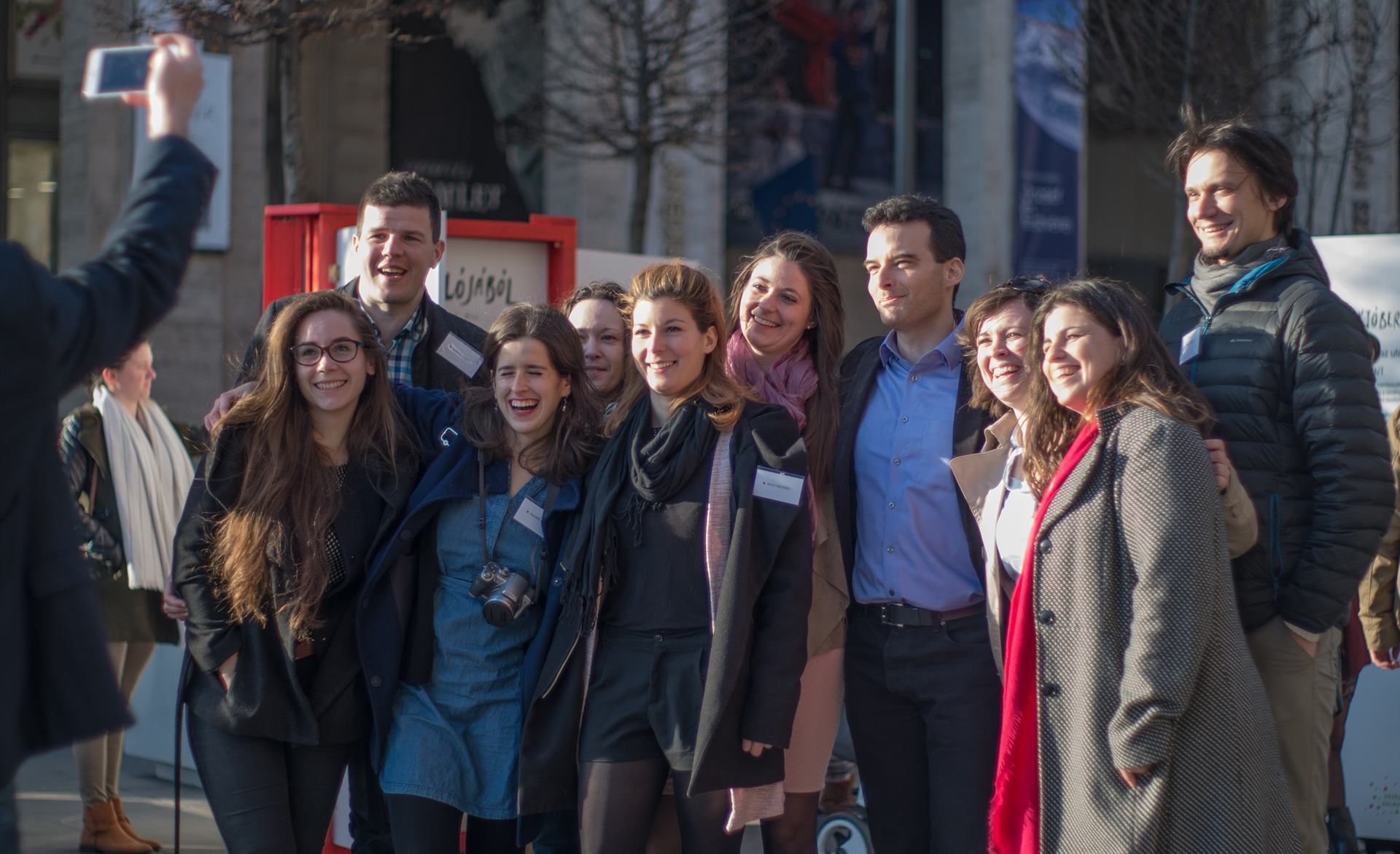
In addition to its five-member board of trustees, Common Ground is helped by the contributions of over a dozen volunteers. The team is both diverse and versatile, including designers, teachers, economists, political scientists and many others.
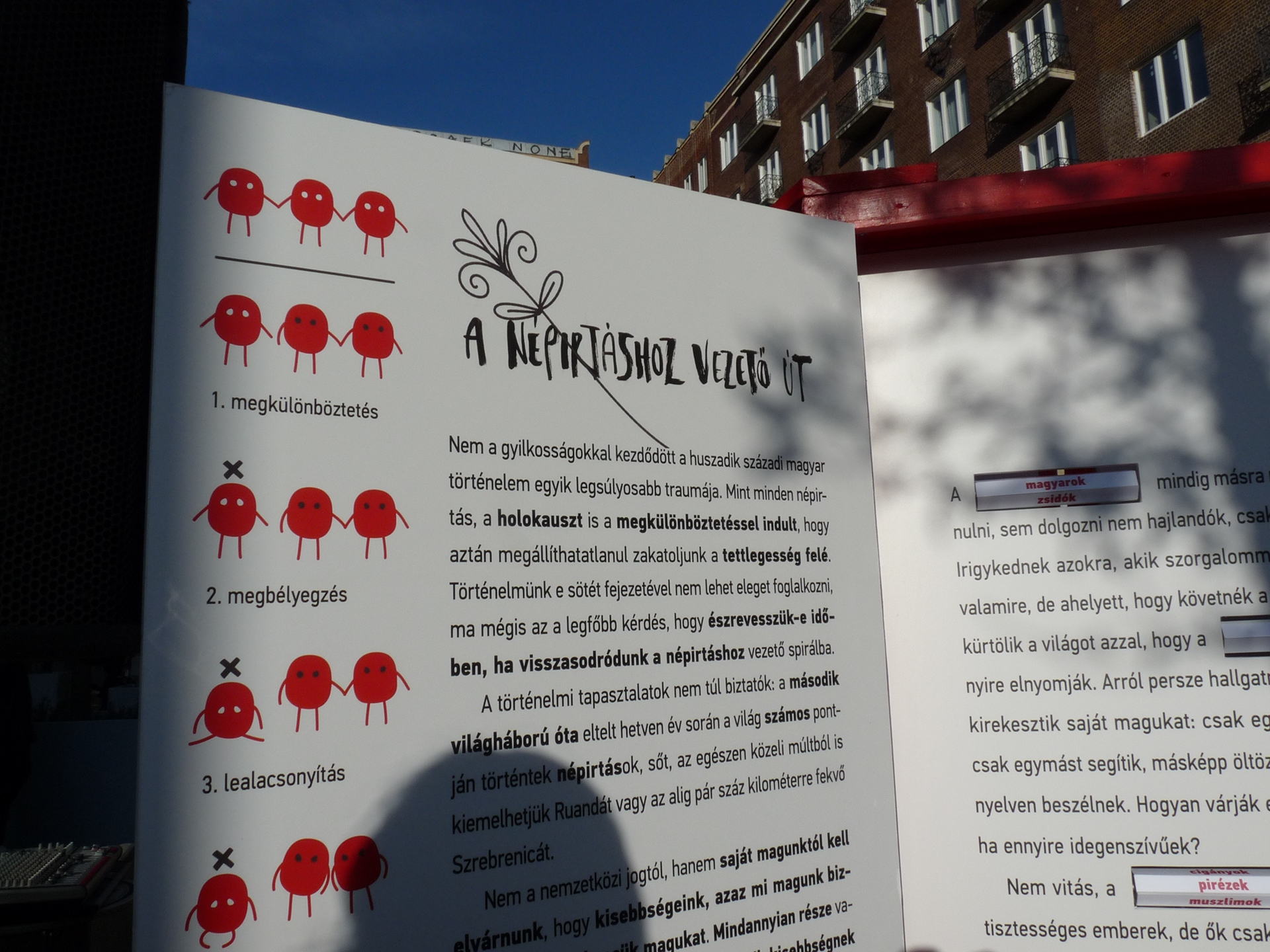
Creating the visual language and design required close collaboration with the writers and the industrial designers to figure out how to best represent sensitive topics on the framework of doors with turning, flipping or pulling elements hidden inside.
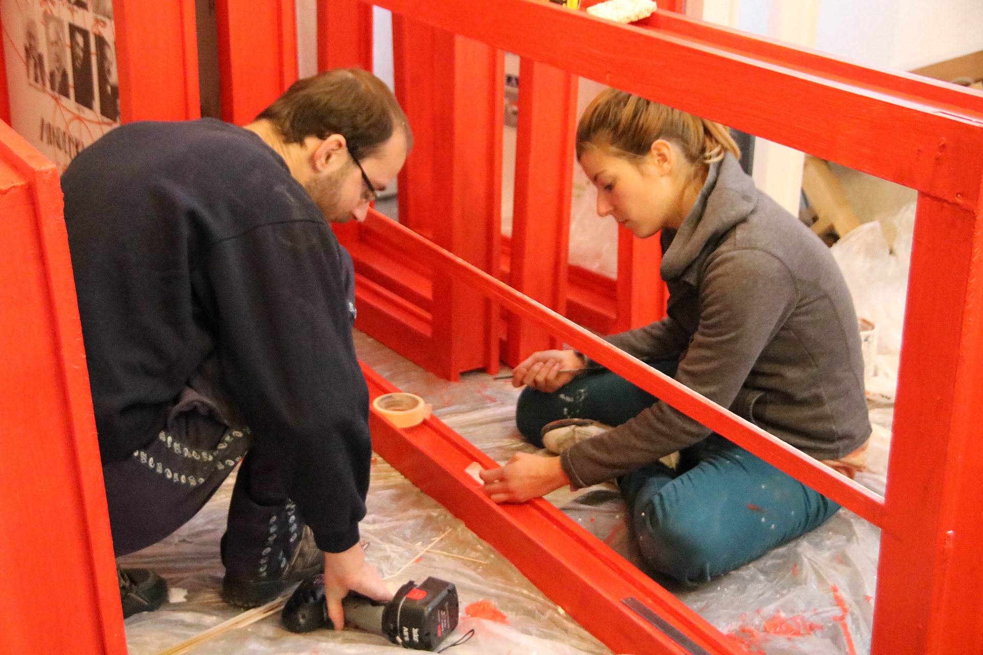
Upon joining the foundation, I proposed three different directions with moodboards for the visual language of the exhibition. We agreed the form should reflect our intention to be the starting point for conversations that the audience will continue, not the final answer. The red embroidery representing traditional symbols with fresh lines and the hand-lettering shows a familiar and personal tone; it's whimsical and memorable. The style of illustrations, while cute and sometimes witty, are pushed towards abstraction to avoid platitudes and arrive to meaningful conversations instead of getting hung up on the accuracy of representation. If they are provoking, that can also be the starting point for self-examination. Before the exhibition, we presented smaller-scale models of four doors to a selection of 30+ experts in their own domain and gathered feedback. The final execution was financed from various sources, including a crowdfunding campaign.
Educational programme
Using the doors as educational aid, volunteers of Common Ground facilitate extraordinary history classes at secondary schools, enabling students to discuss the traumas of history, and how these affected their families – all in an open-minded, thoughtful and emphatetic manner.
The visual identity
Next to creating the exhibition's visual language including the illustrations, lettering, layout and typography (with the help of a typesetter), I also redesigned the foundation's brand to better fit the mission. Since the foundation's brand is mainly used during fundraising, the visual tone is polished and corporate-compatible.
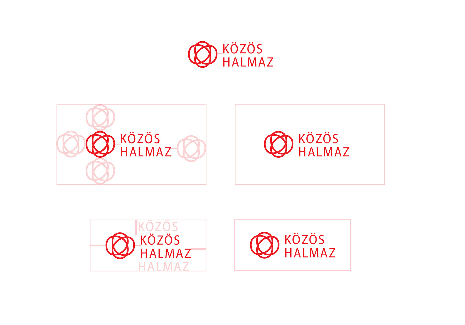
Közös Halmaz means common point and also intersecting set in the mathematical sense. The latter meaning was reflected in the first version of the identity: the logo is drawn with one single line but still creates walls between the empty spaces. In colour and form it resembles Hungarian hussar dress motives while being very neutral and objective.
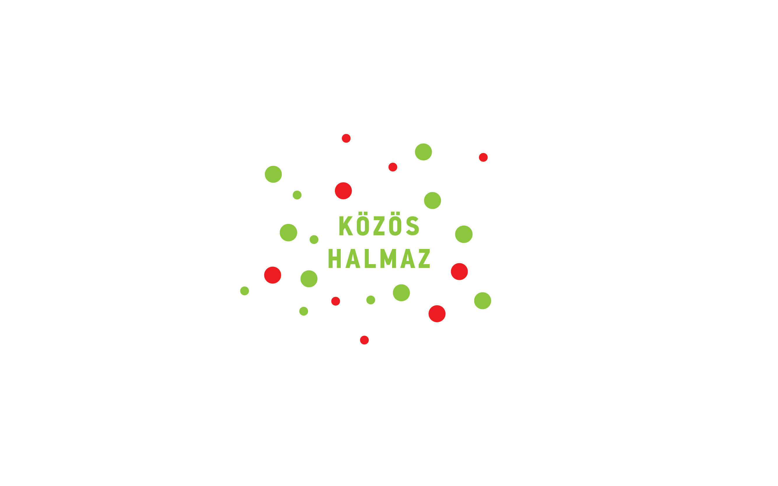
However we stepped away from this version as it did not include the national colours (red, white, green). In the recent years of politics these colours were used only by the right wing, thus taking it away from a part of the country, so it had to be included in the visual identity.

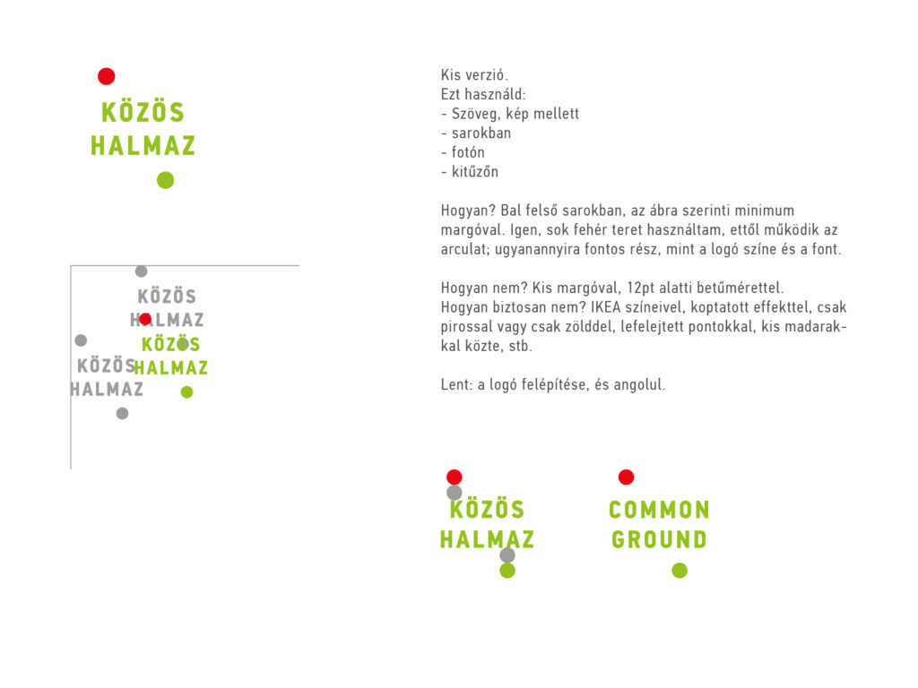
The second version's logo represents smaller and larger groups at different distances from each other and the center, separate but connected by being together. The version with only two dots can be used on smaller surfaces as it still includes the representation of a dialogue born with the help of Közös Halmaz.
Web: kozoshalmaz.hu or www.facebook.com/kozoshalmaz
E-mail: info@kozoshalmaz.hu

No comments.