Complex interfaces at Steady
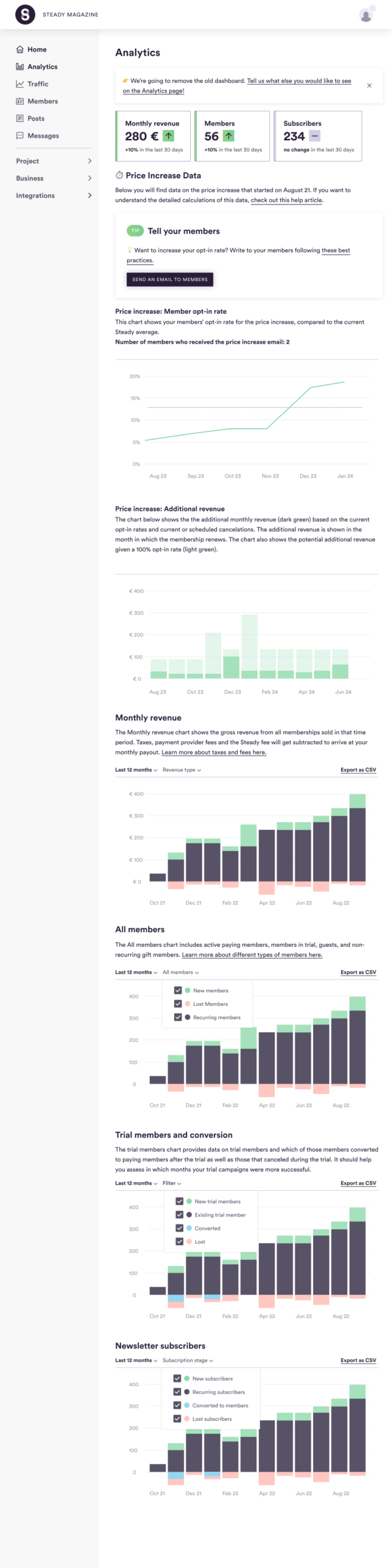
Analytics improvements
When we retired the backend of the previous dashboard, we set out to create a new and improved MVP design that could be easily improved later on.
- Add more charts based on user research, and highlighted the key takeaways
- Create a modular structure, so we could add temporary, but relevant elements and push down or remove them later on
- Remove data points that weren’t informative or actionable
- Clearer and more useful filters based on user feedback
- New or improved explanations for each chart
- Align the elements to the existing design system
- Clear the way to add a new temporary feature (price increase) and show its benefits
Constraints (out of scope):
- Making significant improvements to the existing design system, like adding more colors, changing the basically one-column page layout, or creating more visually distinct sections (like adding background colors!)
- Changing the library for data visualization (charts, etc) that provided limited options
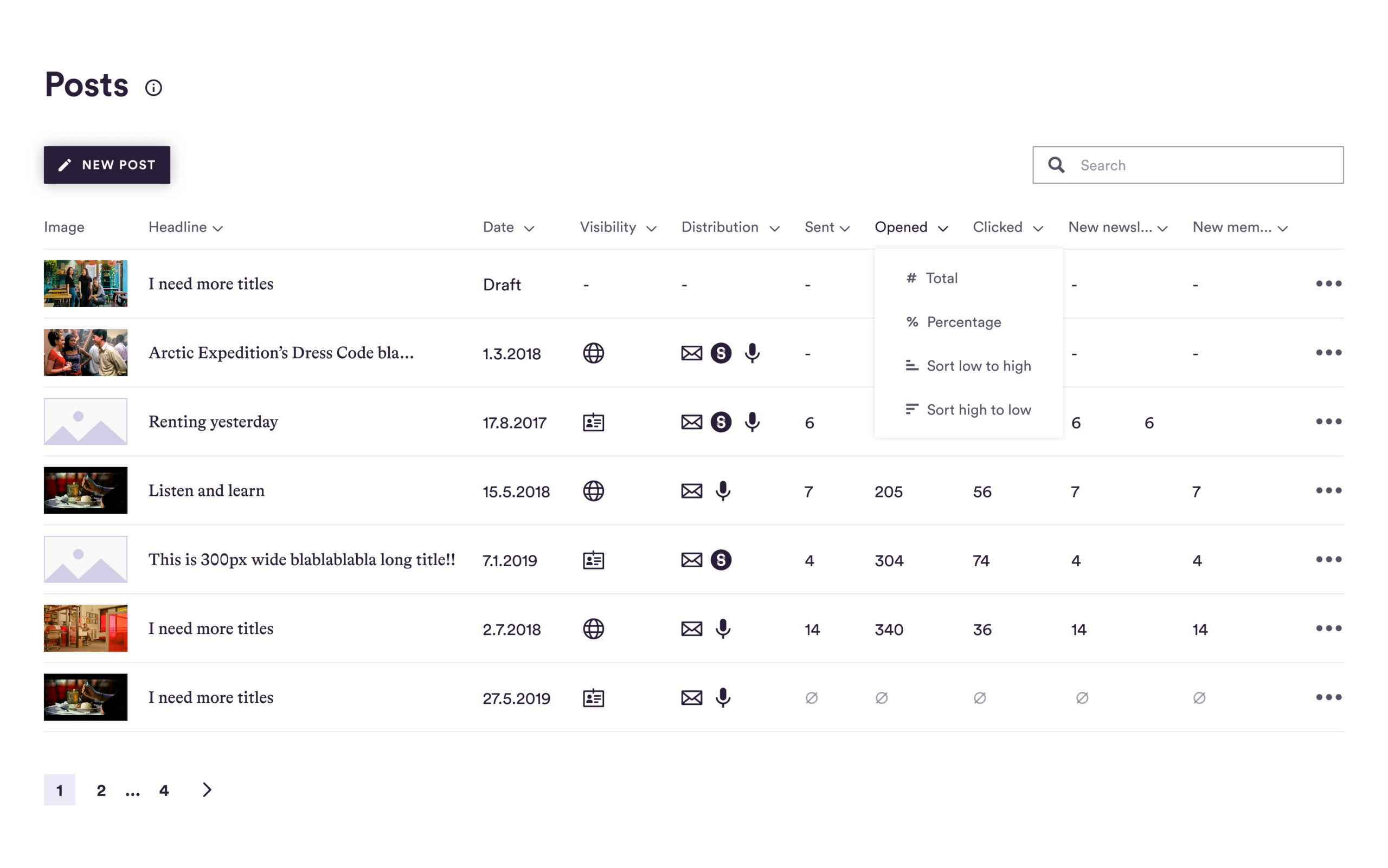
Posts table
This was an MVP UI, with only UX improvements added later on (more columns and actions).
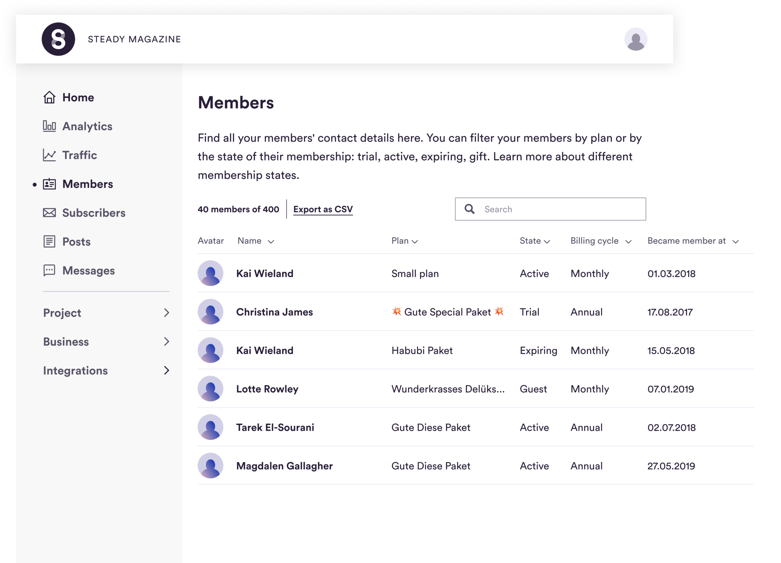
Members table
- Made it easier to read by adding more distinct visual hierarchy
- Aligned to the updated design system
These pages were also fully functional on mobile, but we prioritized desktop views.