FROG–Orchestration Graph
I collaborated with a UX researcher and a software engineer at the EPFL CHILI Lab (Computer-Human Interaction in Learning and Instruction) to rethink the Orchestration Graph interface of the FROG platform (Fabricating and Running Orchestration Graphs), where professors could plan and then conduct their classes for possibly 400 students who need to divide seamlessly into pairs or smaller groups for certain activities and then switch between groups or exercises.
The open-source platform lets teachers plan a lesson as a template, and then run the class and modify it on the go without changing the original template. It also allowed an overview of student performance after class. While there was a UI engineer to create an interface, there were several usability and desirability blockers before EPFL could increase adoption outside of the CHILI Lab, let alone other universities, even though that was the goal.
The biggest challenge of this project was to understand the highly academic foundation of the project and then translate it visually into something more approachable, while maintaining its complexity.
Research
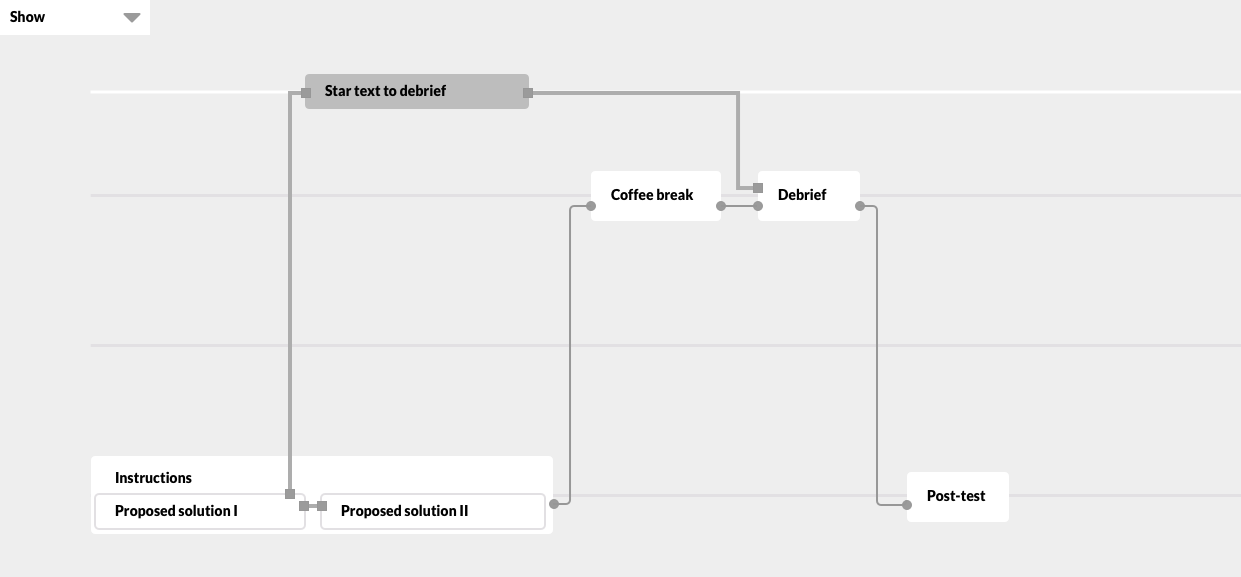
Several tests and the insights on this UI were already available by the time I joined the project. This was the UI they were using before I joined:
The main blocker was getting professors to use the platform or even try and test it. They were very busy between faculty meetings, getting funding for their research team and their courses and seminars. The very technical terms and appearance was alienating them. However, we also knew they valued proficiency and more options over ease of use in the tools they were already using, so the interface could have some learning curve. Usability was more urgent than discoverability.
First wireframes
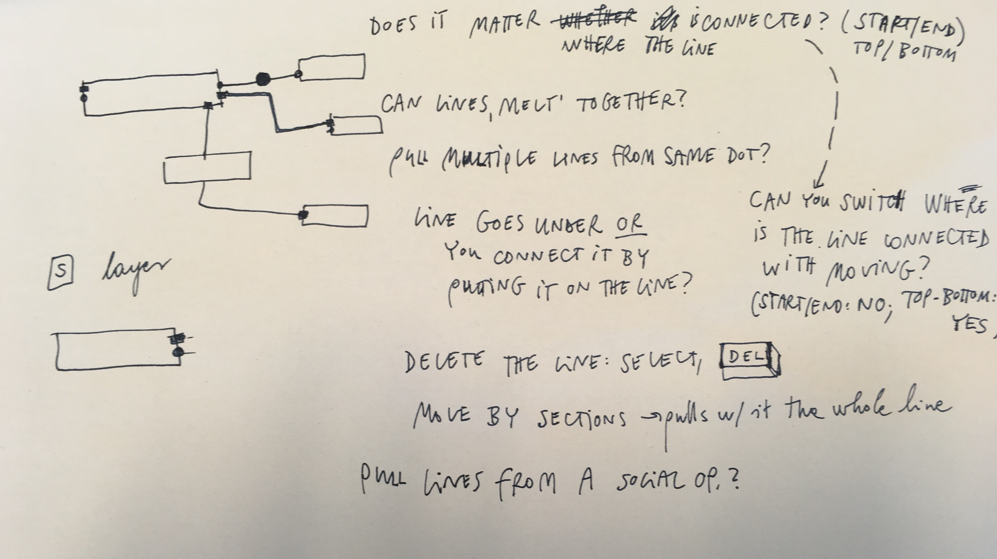
The goal I set was to clarify and differentiate the elements of the graph. Since neither of us knew any interfaces that were similar to what we wanted to achieve based on the CHILI Lab’s previous research, there were no common design patterns or best practices to use here. The closest visual analogy were the elements and connections inside mindmaps or brainstorming tools, so I tried to simulate the behavior I imagined in Omnigraffle.
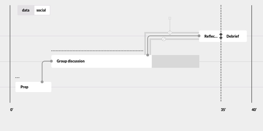
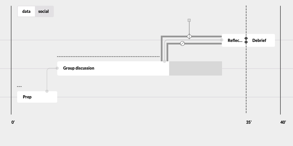
The biggest UI issue was the confusion between activities, such as an exercise, a conversation in a small group or a test, and operators, which were dividing and assigning students to different activities. The visual appearance and behavior of activities and operators were quite similar, which resulted in confusion when a teacher created a lesson plan or was trying to navigate their lesson during the class.
How might we clarify the different role of operators and activities?
In the first version, I connected activities with a line, and place all operators on the lines. Each operator would have their own little shape or icon to be identified with.
Based on the previous research, I also introduced the absolute timeline as a solid line that means the end of the lesson, and a relative timeline with a dashed line that could be changed depending on how the lesson is going.
This is the same lesson plan, just zoomed in to see more in detail. By zooming in and out, the teacher could have an overview of the lesson or just focus on one activity or transition.
Distinguishing operators from each other
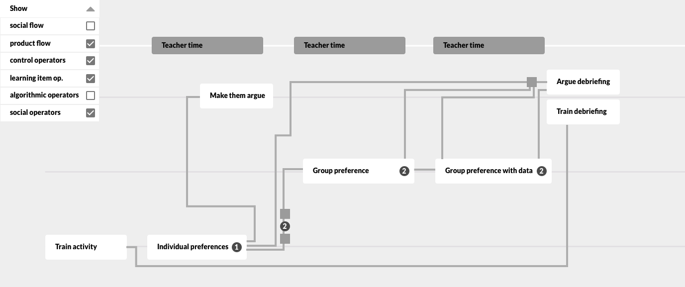
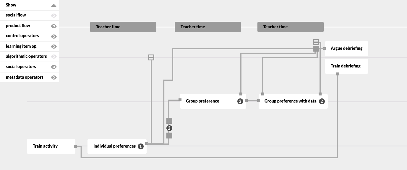
After feedback from the team, we agreed that the visual appearance of operators placed on one line quickly gets confusing. The possible number of variations for operators is not fixed, but constantly growing, so assigning an icon or shape to each of them was not a viable option: it would be chaotic to have 30+ different tiny shapes to remember. After affinity mapping, I divided all operators into social, product and metadata operators.
Social operators would deal with grouping and moving students, while product operators dealt with assigning exercises, tests, reading to students, or collecting answers, projects, etc. from students to the professors or teacher assistants. Metadata operators handled analytical data on student activity (time it took to finish their task, success rate on a quiz, etc.)
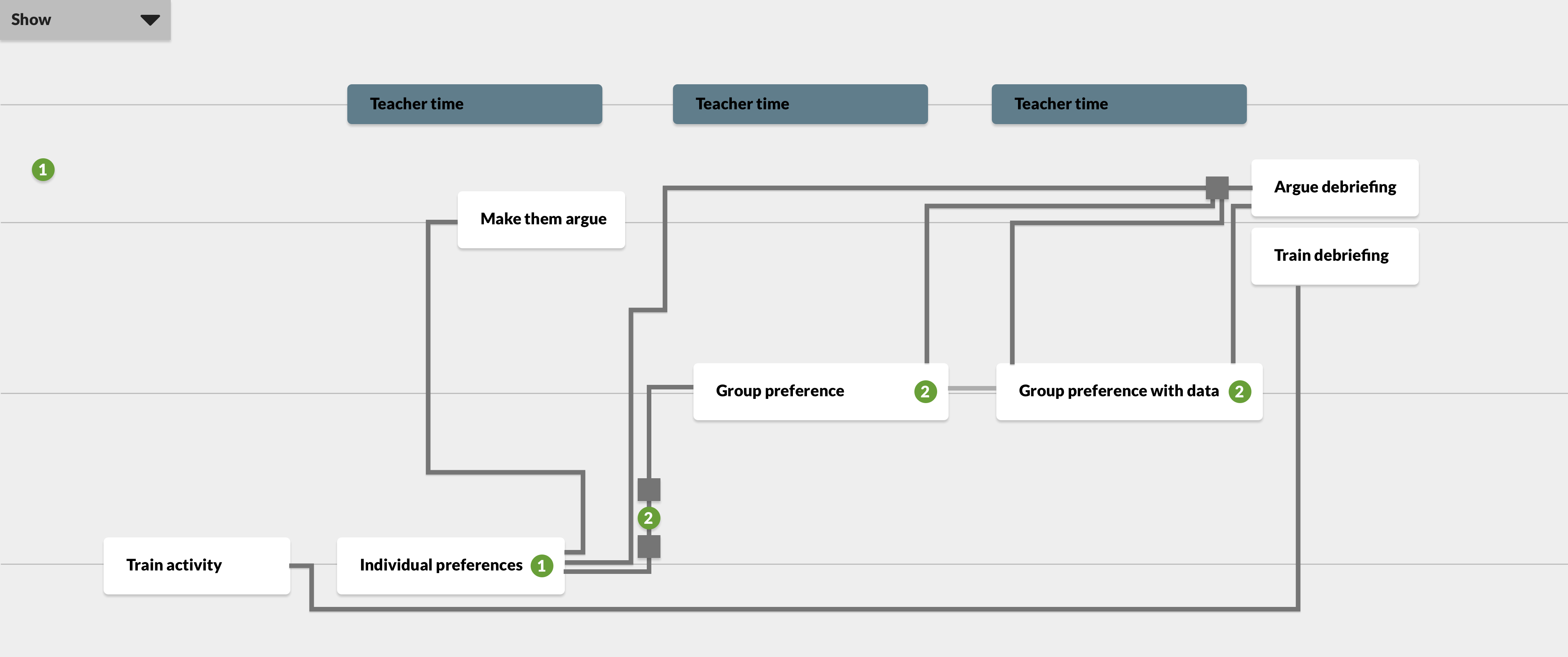
Lesson scenarios
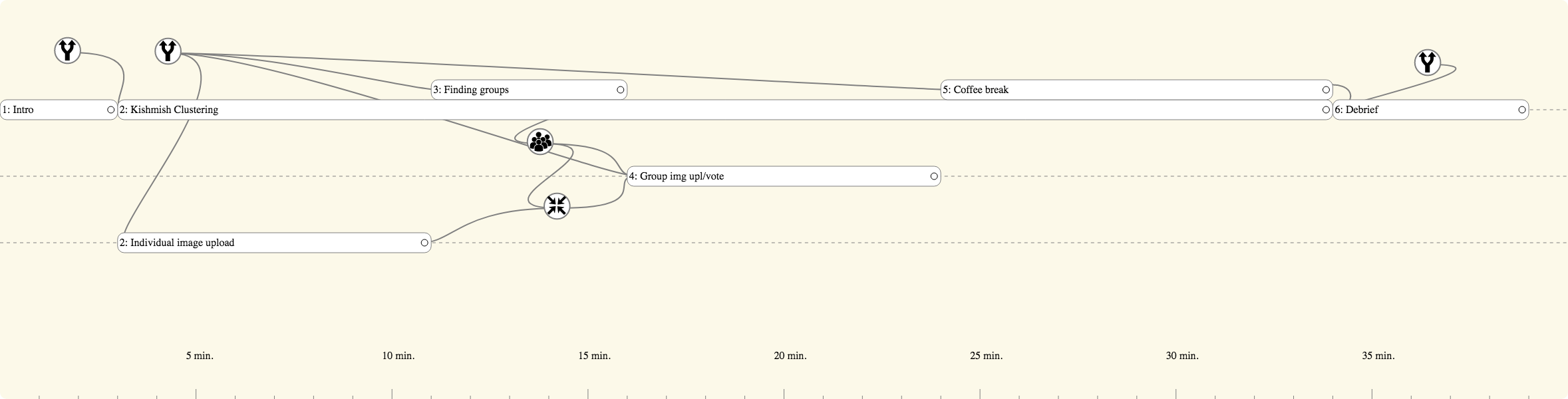
From then on, I focused on modeling a few common complex scenarios, such as the rotating class, where each team would do each exercise, but in different order, so the professor can attend to them in smaller groups. I also added the top menu where the user can hide or show different operators; and the teacher plane to bring focus on activities they need to participate in, not just facilitate.
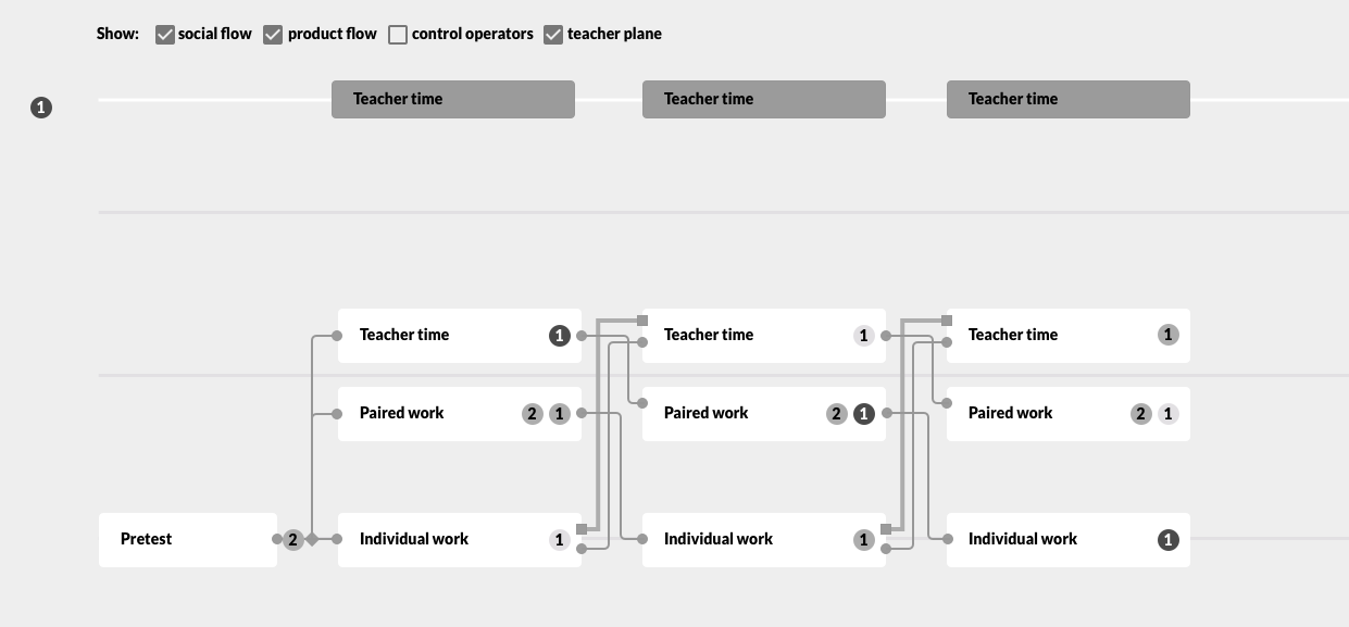
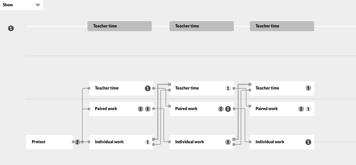
Since the variety of elements to display on the graph increased, I moved the visibility choices to the side into a collapsing menu.
Another scenario was when the orchestration graph should divide students based on their answers in the first task of the lesson. This way, social and product operators were connected: the data directing the social operator was collected by a product operator.
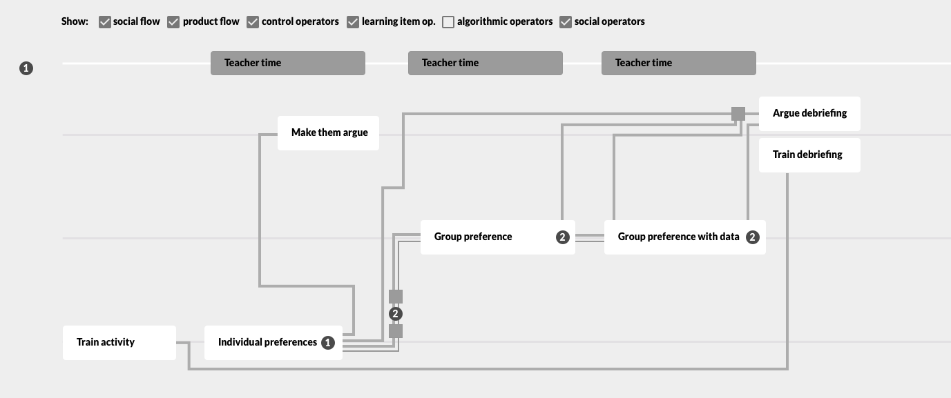
Metadata operators on student performance analytics could also save the data for another lesson or import data from a previous class, so sometimes they did not connect to two activities in the same lesson, just one.
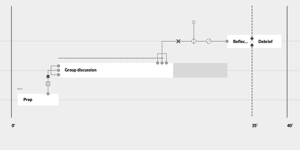
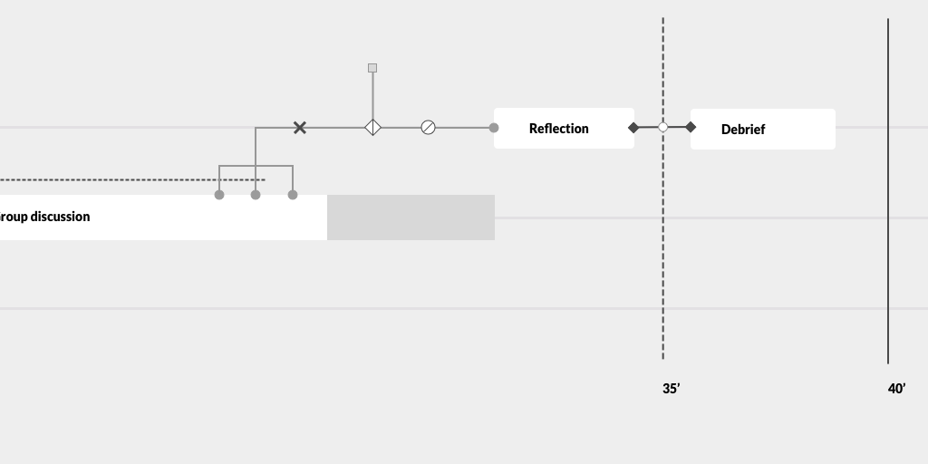
Another use case was the need to group parallel activities, and to indicate a break during the lesson.
I also displayed the status of students on the timeline with the tiny dots over the activities. This way professors could see at a glance where their class is during the lesson, and whether they should slow down or speed up for the rest of the class. Or maybe there won't be enough time for all activities they planned, so they can reorganise and delete some activities in the orchestration graph without disturbing anything else.
At this point, I graduated from my MA degree, so I also had to finish my collaboration with EPFL. I presented my progress to everyone working on the FROG (Fabricating and Running Orchestration Graphs) team at the time. We agreed on the direction and the next steps, and I handed over my designs to a UI engineer.
Many thanks to EPFL CHILI Lab and especially to Jenny Olsen and Stian Haklev for collaborating with me on this fascinating project!