Strategic IA improvements at Steady
Context
As the only senior product designer, I took ownership of the IA of the whole product and marketing pages for 3 different user groups - visitors (potential users), members and creators.
Goal:
- Increase the usability of the product: remove confusions and align namings across pages.
- Improve SEO and brand awareness
- Improve accessibility
Project duration: 2022–2023
Challenges
I. Major feature releases (meaning a bunch of new pages and a new menu) from the previous year. These functions introduced new user flows created journeys that broke down in some places.
II. While it was evident that menu structures became complicated, there was no clear and explicit ownership of them.
III. There was very little information to start with. Most data came from onboarding and general discovery research calls.
IV. Important links were hard to find or missing in certain views, and we displayed the same menus and footers in very different use cases.
V. After EU legislative changes, we also needed to add a few more required links.
VI. I needed buy-in from Head of Marketing, Engineering and Product to prioritise the necessary changes.
Results
- 71- 92% increase in SEO ranking and organic traffic growth for certain keyword
- Traffic increase on our Discovery page, where we show creator projects
- Greater consistency in naming and styling
- More detailed and accurate page view analytics in the backend
- More transparent menu structures that increased clarity across the product
What? And how? Keep scrolling to see the process.
Solutions
Getting buy-in to prioritise changes
• take charge to move this project forward not as its own initiative, but bundle it with more clearly measurable projects to make it a priority
• tie these changes to improving our SEO and brand awareness
Product design
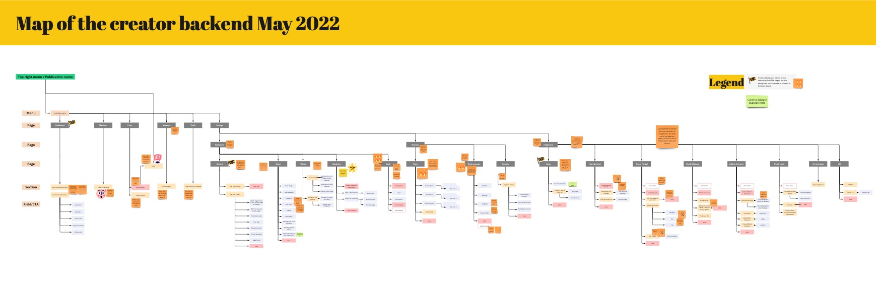
- map out the whole product to see the inconsistencies and misalignments:
- creator backend pages
- member backend pages
- visitor-facing creator pages
- all top navigation menus (where users can switch between creator and member view)
- all the footers
- agree and align on naming inconsistencies
- increase internal linking to make creator projects and our own content more discoverable
- clarify and implement new legal requirements
- start collecting automatic screen recordings of users navigating the product
- increase brand awareness by switching out the logo to a wordmark&tagline of the company in the top menu and the footer
- added more entry points to our content on creator guidance to make it more accessible both to visitors and creators
Accessibility improvements
- eliminate naming inconsistencies in menus and within pages
- move key information out of help articles onto the product pages, and link to more information
- reviewed and improved interaction states (default, hover, active)
- added a CTA to creator onboarding to increase new creator signups
- made a clear distinction between menu categories and page titles to make navigation more consistent
- reviewed and increased target size where necessary
- removed small caps from menus to improve legibility
Menu changes
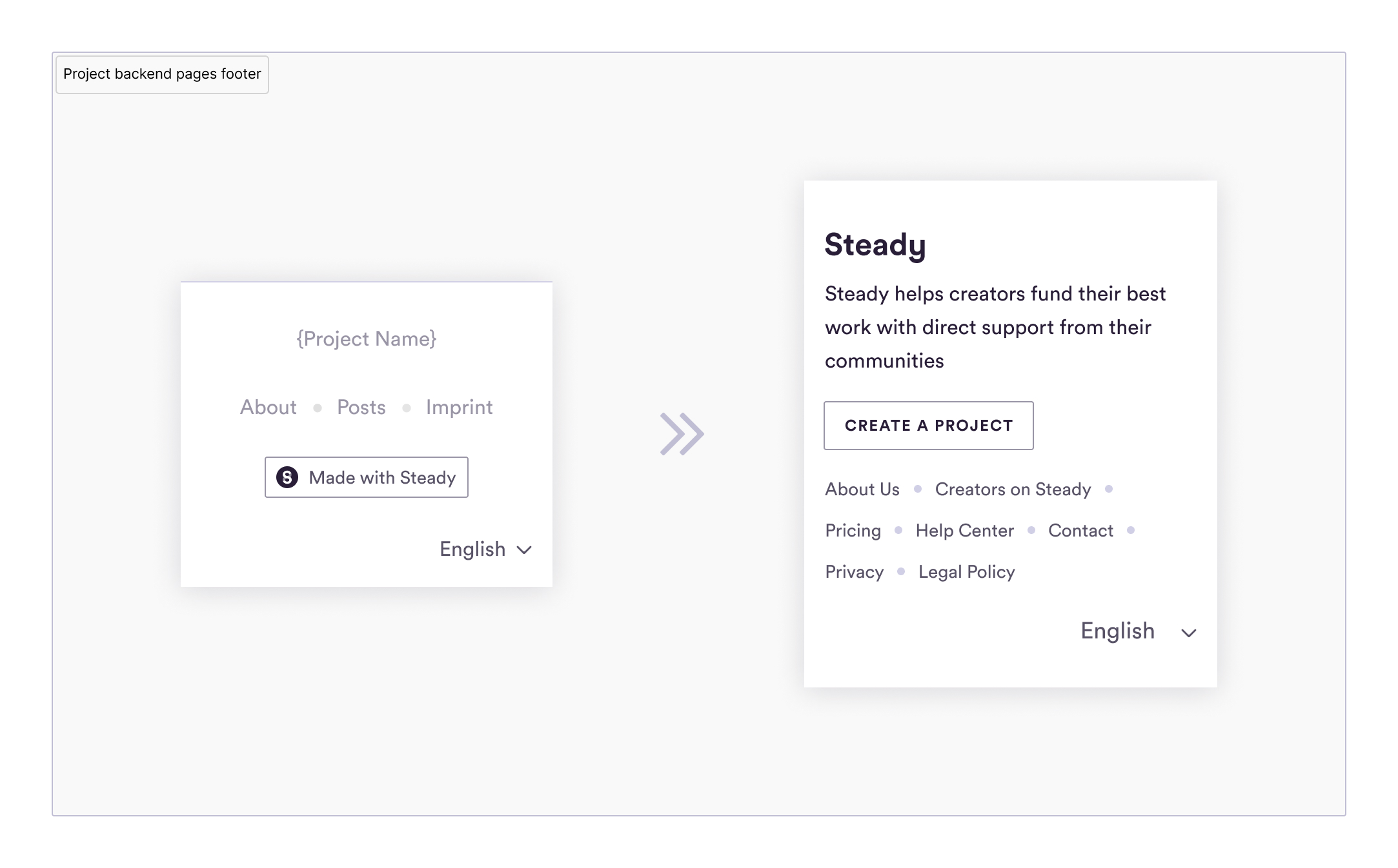
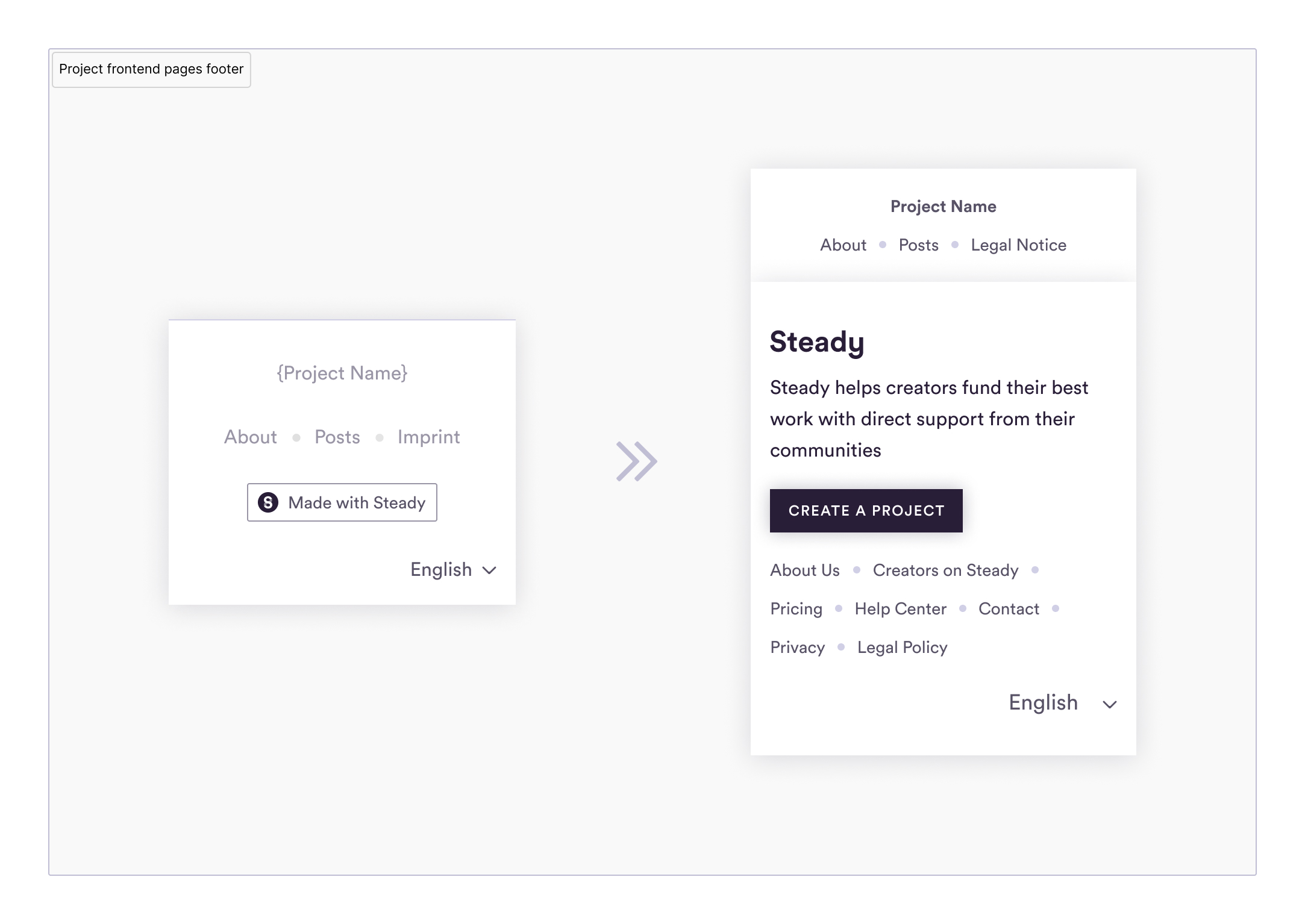
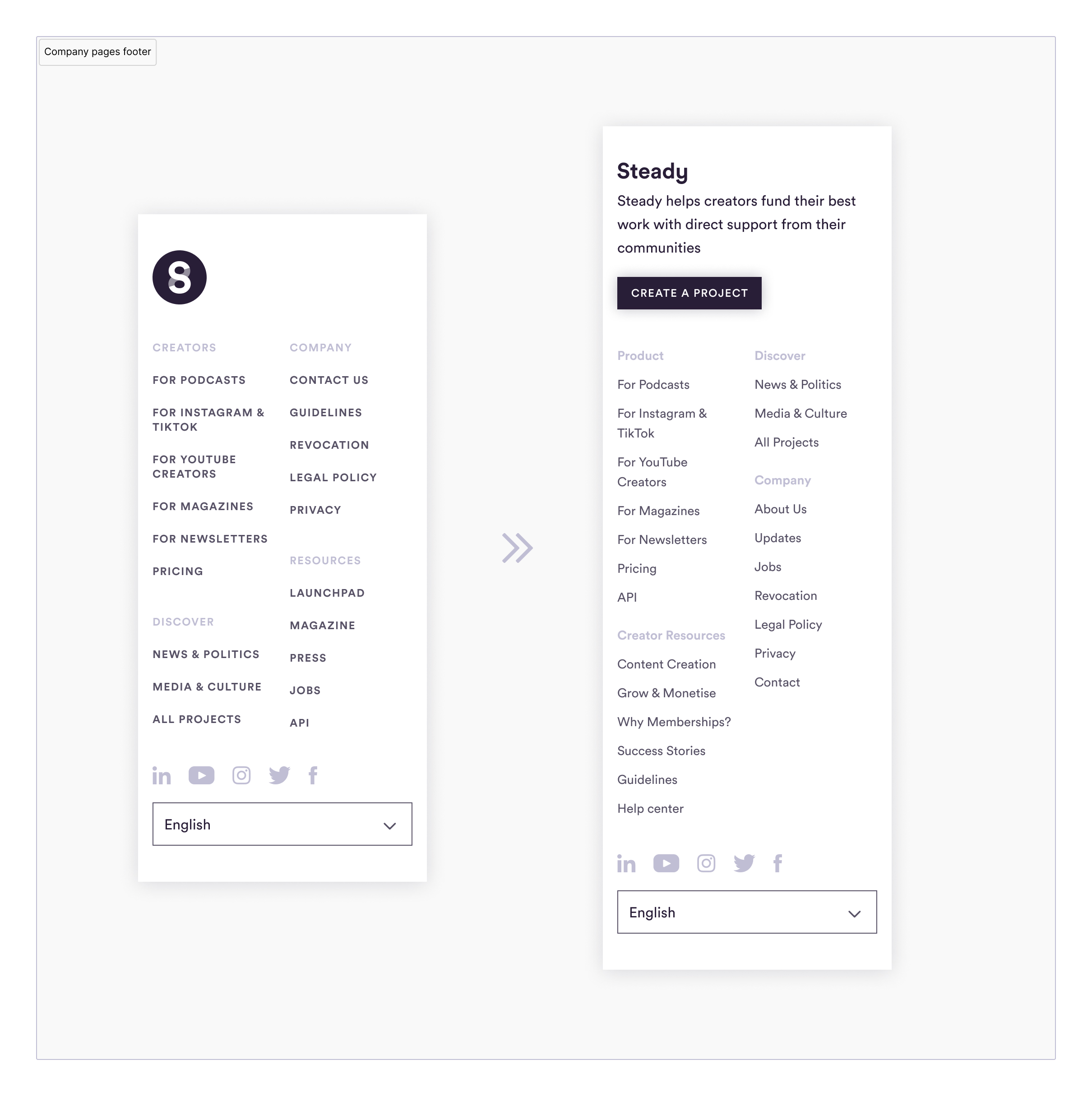
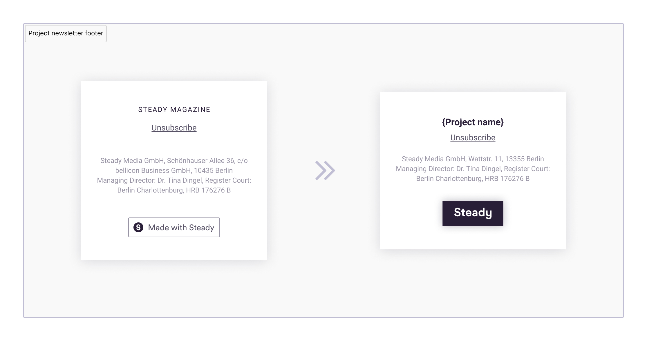
All the footers: project pages (backend and visitor-facing), company pages and project emails
- increased internal linking to our guidance content to establish ourselves as an expert on the topic to improve SEO
- added the wordmark and the tagline to every footer to increase brand awareness
- aligned the wording and the visual style to improve consistency and trust of the platform
- added company contacts to project footers as well (legal requirement)
- added a CTA to creator onboarding to increase new creator signups
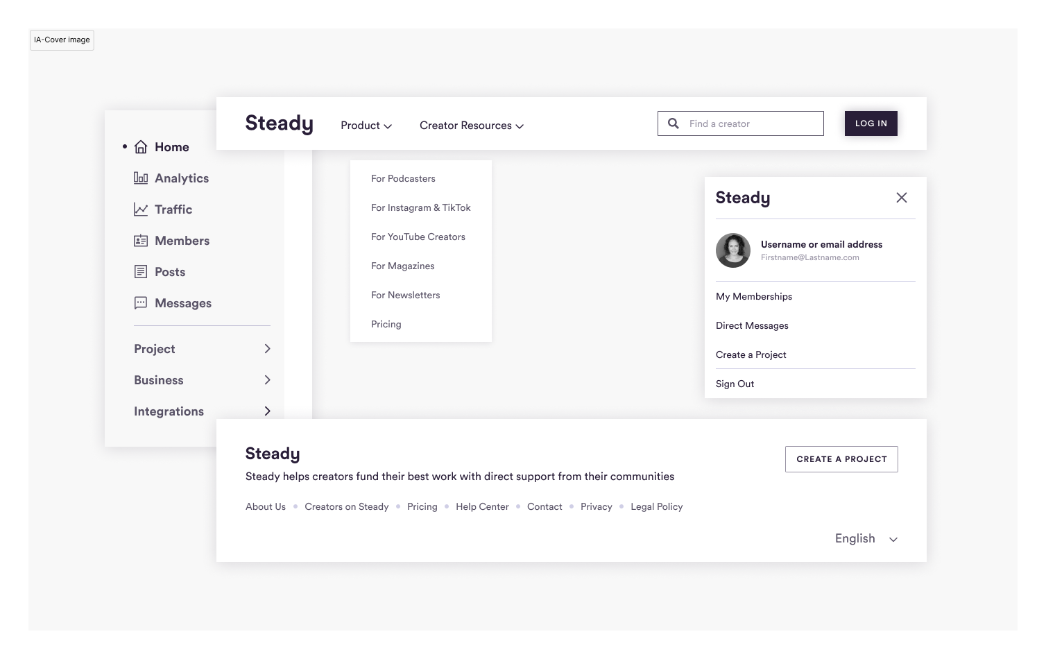
Top navigation changes: project pages and company pages for visitors and logged-in users
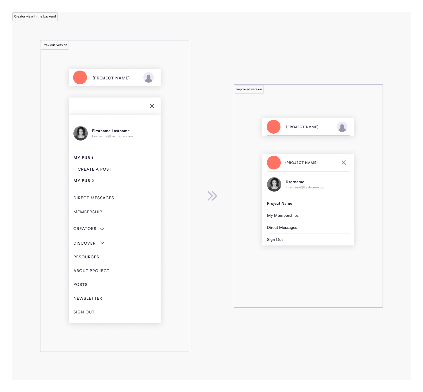
Creator backend: remove everything in the right menu that's also available in the backend settings, this is only a place to switch between projects and user modes.
Visitor view on project pages–this is a place owned by creators and helping their revenue growth:
- removed menu items that are relevant to Steady the company, not the creator
- added a search field to improve creator discoverability, and a [Subscribe] button to improve their newsletter reach
- the second row of navigation helps showcase creator content and the option to purchase a membership, which improved membership conversion rate and decreased dropoffs
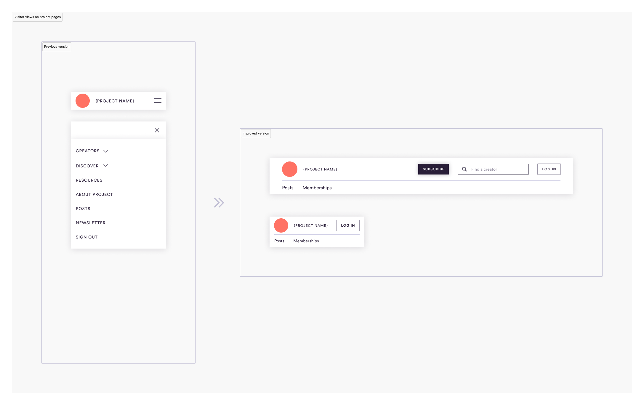
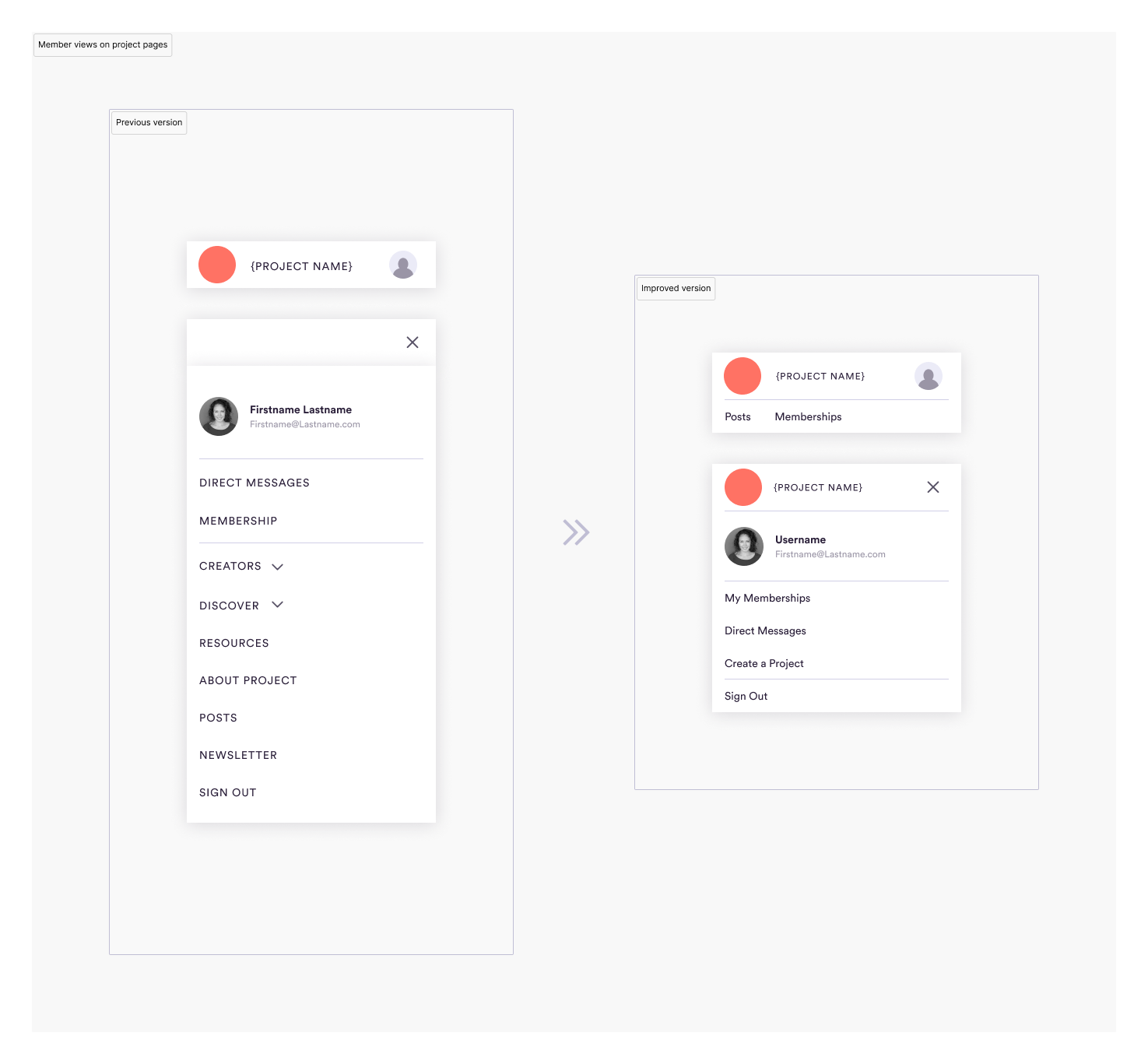
Member views on project pages–this is a place owned by creators to help improve member's engagement:
- removed menu items that are relevant relevant to Steady, the company, not the creator
- the second row of navigation helps to find and showcase their content
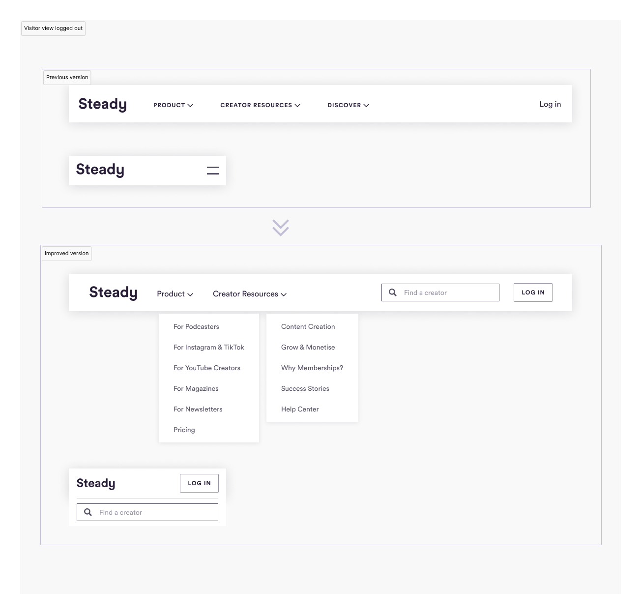
Visitor view of the Steady marketing pages (view changes from top to bottom!)
- increased internal linking to our guidance content to establish ourselves as an expert on the topic to improve SEO
- made Discovery of creators more easily accessible by adding a direct search field to improve creator's reach
- aligned elements to our design system to improve usability and consistency
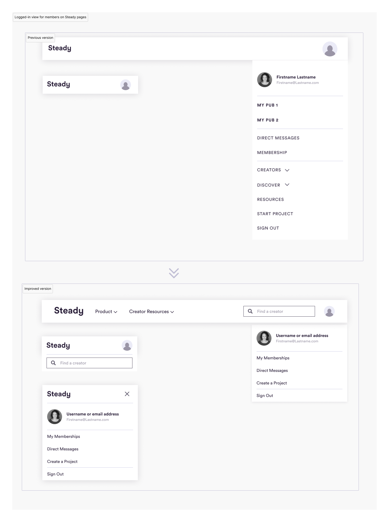
Logged-in view of the Steady marketing pages for members/creators (view changes from top to bottom!)
- removed everything from the right-hand menu besides switching between memberships and projects to eliminate duplicates
- aligned elements to our design system to improve usability and consistency
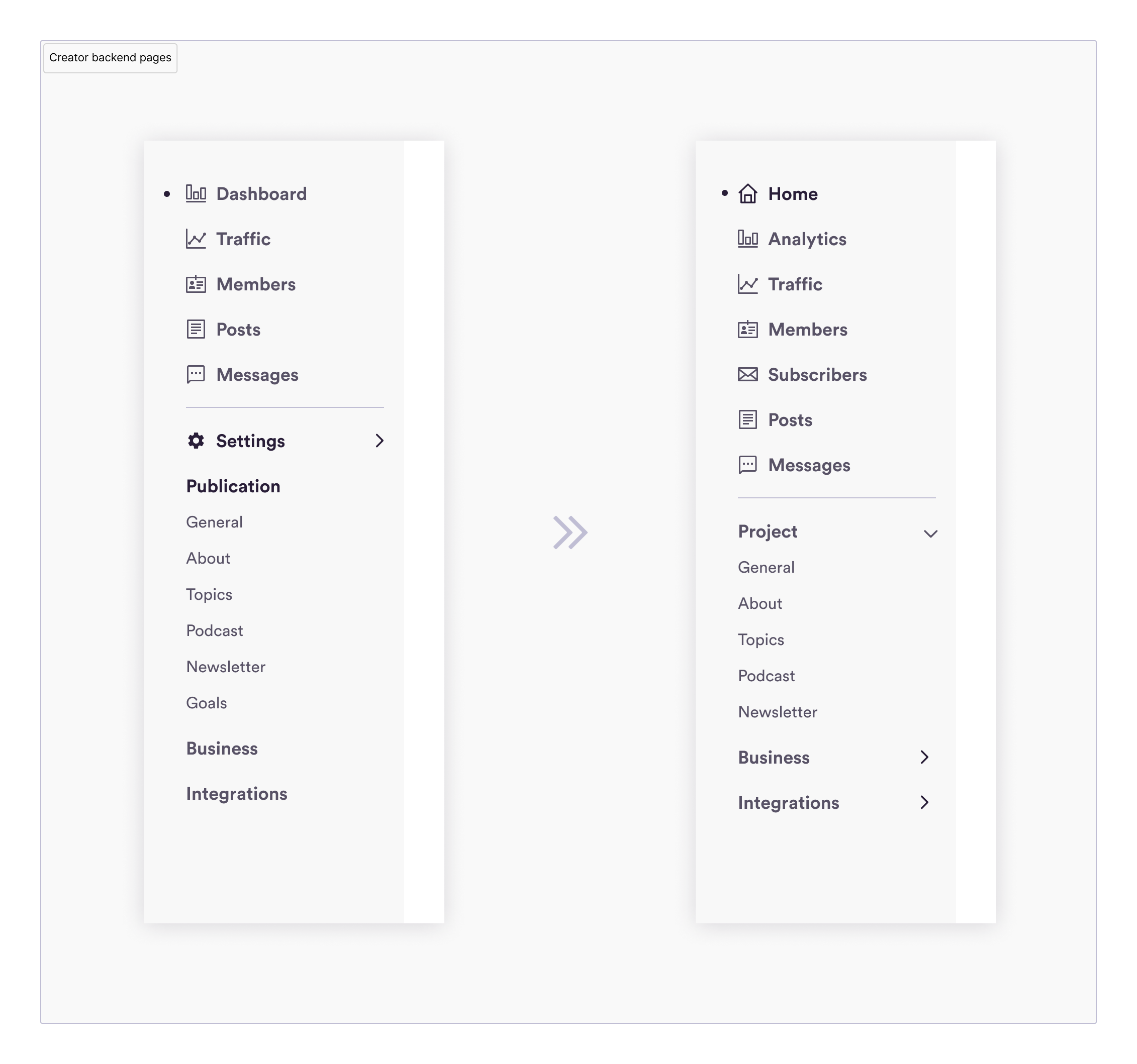
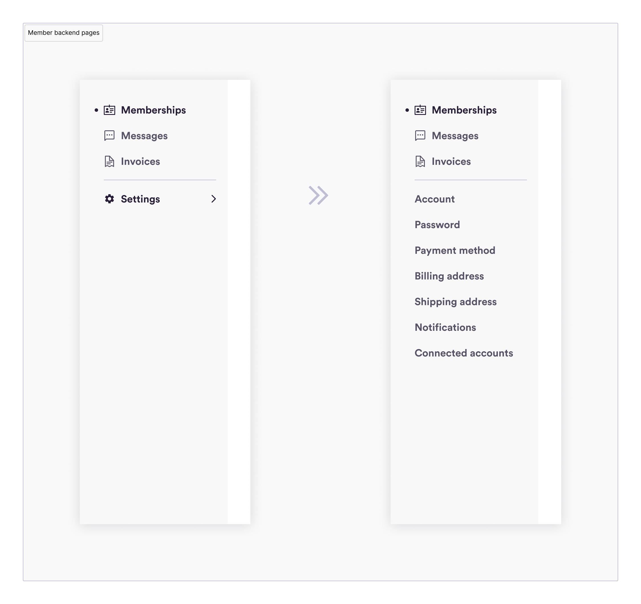
Left menu changes in the creator and member backends
- clarified and separated menu category names from page titles to start collecting more detailed and accurate page visit analytics
- moved pages under the correct category
- changed Publication to Project
- added a new page (and table) for (free) 'Subscribers', as their data had almost nothing in common with member data
- added a new 'Home' page as the starting point for next actions and steps, and renamed Dashboard to Analytics to avoid confusion
- moved some input fields between Project/General and Project/About to accurately reflect the page's purpose
- opened up the member's table menu list to give a better overview of the settings
Many thanks to UX, my dear for the initial support and guidance on this project!